12 Generalized Linear Models
This module will teach you how to use Generalized Linear Models to assess the importance of management-relevant environmental factors for fish species
Authors: Ed Stowe
Last update: 2026-01-09
Acknowledgements: Some inspiration/language/code have been used or adapted with permission from: Ben Staton’s Intro to R for Natural Resources course; and Quebec Center for biodiversity Science’s Generalized linear model workshop
12.1 Learning objectives
- Understand how generalized linear models might be used to inform USACE planning proccess
- Understand why and when to use generalized linear models
- Learn how to interpret output from binomial and negative binomial regression
12.2 Generalized Linear Model Background
When USACE biologists and planners are trying to understand important factors controlling a species that will be the target of restoration, they may use linear modeling to determine if empirical data matches the expectation of a habitat model. Or if a habitat model doesn’t exist, it may make sense to use linear modeling to inform the habitat models. In some cases, the linear models that we explore in the previous section, linear models, may suit this purpose. Linear models assume that the residuals of a model are normally-distributed and that the response variable and the predictor variables are linearly-related. However several ubiquitous types of data used in ecological modeling–such as presence/absence data or counts of organisms–do not follow these assumptions. For these types of data, Generalized linear models (GLMs) can overcome these problems. Therefore, if USACE planners wish to see how certain environmental variables are related to these types of biological outcomes (e.g., presence of a species), they may wish to use GLMs
Here we will not go into all of the statistical details of GLMs, but for a more in-depth description of the statistical underpinnings, see here and elsewhere. It is important, however, to understand three key elements of GLMs:
-
Response distribution: A probability distribution for the response variable Y, such as the binomial distribution for binary data or the Poisson distribution for count data.
-
Linear predictor: A linear combination of explanatory variables (η=Xβ), analogous to a standard linear model.
- Link function: A function that relates the mean of the response variable’s distribution (μ) to the linear predictor (η). The choice of link function is typically guided by the response distribution; for example, count data modeled with a Poisson distribution often use the natural logarithm as the link function.
The most common examples of GLMs in ecology are logistic regression for binary data or poisson and negative binomial regression for count data.
12.3 Logistic regression
Binary data, which have two opposite outcomes, is common in ecology, for example, present/absent, success/failure, lived/died, male/female, etc. If you want to predict how the probability of one outcome over its opposite changes depending on some other variable(s), then you need to use the logistic regression model, which is written as:
\[\begin{equation} logit(p_i)=\beta_0 + \beta_1 x_{i1} + ... + \beta_j x_{ij}+ ... + \beta_n x_{in}, y_i \sim Bernoulli(p_i) \tag{12.1} \end{equation}\]
Here, \(p_i\) is the probability of success for trial \(i\) at the values of the predictor variables \(x_{ij}\). The \(logit(p_i)\) is the link function that links the linear parameter scale to the data scale. The logit link function constrains the value of \(p_i\) to be between 0 and 1 regardless of the values of the \(\beta\) coefficients.
The logit link is equivalent to the log odds ratio, in other words, the natural log of how likely an event is compared to it not happening.
Therefore, with logistic regression, the model will calculate the log odds of an outcome, so if we want to know the odds ratio (i.e., ), we just take the inverse log. The example analysis that we conduct will make this more obvious.
12.3.1 Example logistic regression anaysis
In our example logistic regression analysis, we’ll use the same fisheries dataset from three of the navigation pools in the Upper Mississippi River that we used in our chapter on linear models. These fish data are collected to understand long-term trends of the river, but we’ll use the data to see what relationships may exist between habitat predictors and fish responses.
12.3.1.1 Import and explore data
First we read in the data filter it so that it only includes data from daylight electrofishing (gear == "D"), backwater habitat, and depths < 5 m, as this is where this gear is most accurate.
library(tidyverse)

umr_wide <- read_csv("data/umr_counts_wide.csv")

#Period already filtered to 3
umr_sub <-  umr_wide %>%
  filter(gear == "D",
         stratum_full == "Backwater",
         depth < 5)
Let’s look at the column names of our dataframe. We see that the last 10 columns, starting with BLGL are codes for species. These columns are counts of the different species in each sampling event.
names(umr_sub)## [1] "date" "utm_e" "utm_n" "stratum_full" "year" "period"
## [7] "pool" "gear" "secchi" "temp" "depth" "cond"
## [13] "current" "do" "substrt" "vegd" "BLGL" "FWDM"
## [19] "CARP" "LMBS" "ERSN" "BKCP" "SHRH" "GZSD"
## [25] "WTBS" "SFSN"Counts can be very “noisy” data and often difficult to predict, so it’s common to instead model presence/absence. In order to do this, we can convert our counts to 1’s and 0’s using the following code. Here we are using mutate to change the values of each of the species columns. case_when is a dplyr function that operates similarly to an if-else statement. So here, we are saying that in all the columns with species names, if the value is greater than 0, we convert this to 1, and if the value is not (i.e., if it’s 0), it will remain 0.
species <- names(umr_sub)[17:26]

fish_binary <- umr_sub %>%
 mutate(across(any_of(species), ~ case_when(. > 0 ~ 1, TRUE ~ 0)))
We’re going to examine whether any of the predictor variables in the dataset are predictive of the occurrence of one of the species, the common carp. Being able to predict habitat variables that influence the presence of a species might be the basis for predicting how USACE management activities impact species.
First, let’s plot common carp occurrence as a function of several predictor variables: temperature, water transparency (i.e., secchi disk reading), depth, and conductivity. To do this most easily with ggplot, we need all of the variables in one column so we can use the facet_wrap function to make a singe panel for each variable. To do this we create a dataframe called carp_long using the pivot_longer function to go from a wide format to a long format, which makes the plotting seemless.
carp_long <- fish_binary %>%
  select(CARP, secchi:do) %>%
  pivot_longer(cols = secchi:cond, names_to = "variable", values_to = "value")
In pivot_longer we tell which columns we want to combine, what we should name the column that now inclues the variable names and what we should name the column that includes the variable values.
Now we can plot the variables.
ggplot(carp_long,
         aes(value, CARP))+
  geom_jitter(height = .1, width = .02, alpha =0.5, color = "steelblue")+
  geom_boxplot(aes(group = CARP),
                   width = 0.5, alpha = 0.5, color = "black", fill = "gray")+
  facet_wrap(~variable, nrow = 2, scales = "free_x")+
  scale_y_continuous(breaks = c(0,1))+
  labs(x = "Value of predictor", y = "Carp occurrence")+
  theme_classic()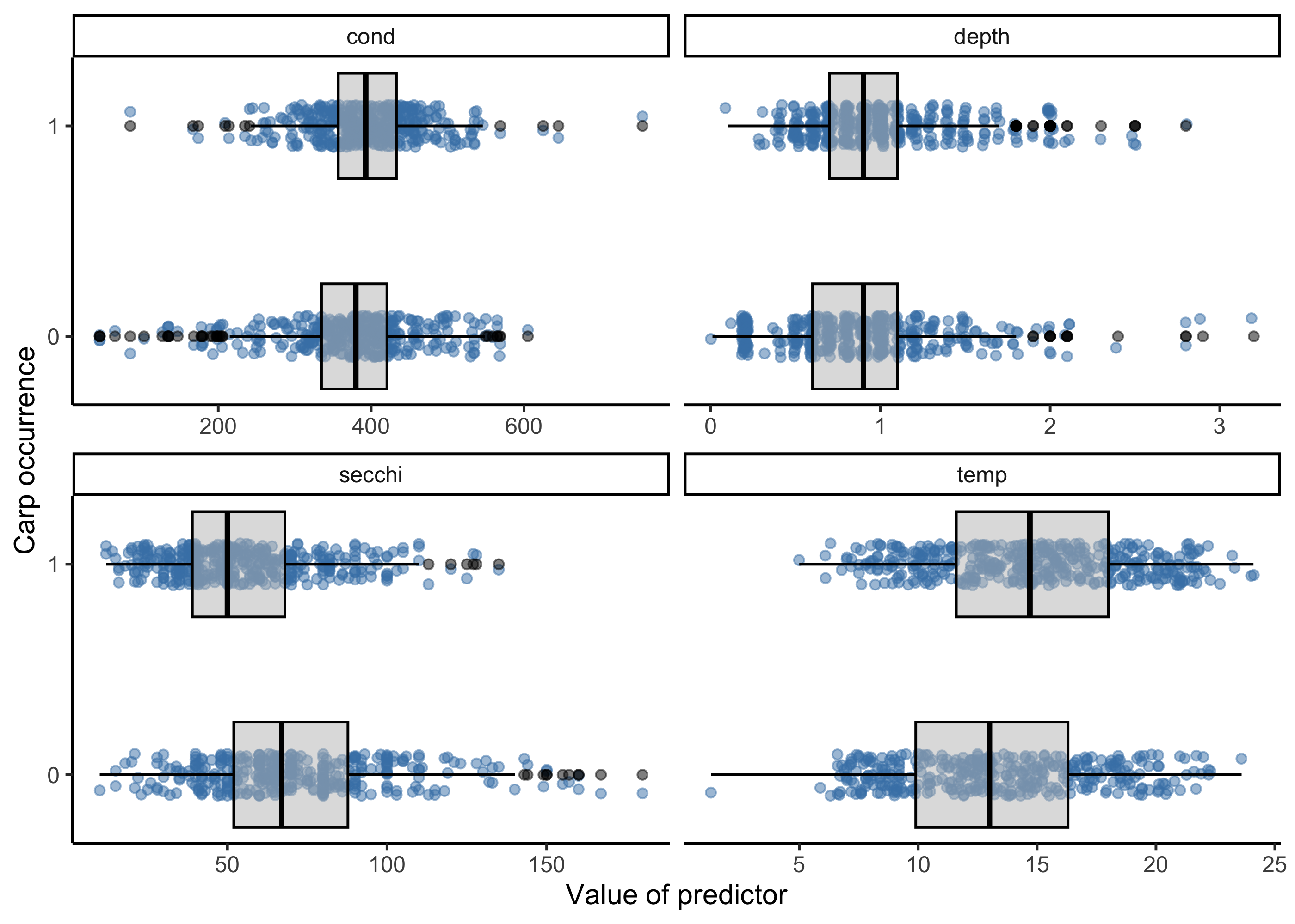
From these plots, a few variables pop out as being potentially important. For example locations with carp occurrences appear to have lower secchi disk readings (i.e., less clear water) and higher temperatures, but the strength of these relationships are unclear, which is where modeling comes in to play.
12.3.1.2 Fit model with glm function
We’ll use the glm function in base R to do this, and the same kind of formula notation as with linear models, here indicating that we want to model carp occurrences as a function of four of our predictor variables. We’ll use the fish_binary dataset to do this. Finally we need to select a ‘family’ for the error distribution of our response variable. For presence/absence data, the binomial distribution is typically chosen because it’s a distribution with only two states, typically 1 for “success” and 0 for “failure.”
glm.bin<- glm(CARP ~ secchi + temp + depth + cond,
            data = fish_binary,
            family = binomial)
We can look at the results of the model with the summary function.
summary(glm.bin)##
## Call:
## glm(formula = CARP ~ secchi + temp + depth + cond, family = binomial,
## data = fish_binary)
##
## Coefficients:
## Estimate Std. Error z value Pr(>|z|)
## (Intercept) -1.2036029 0.5342537 -2.253 0.02427 *
## secchi -0.0322025 0.0035546 -9.059 < 2e-16 ***
## temp 0.0957375 0.0191719 4.994 5.93e-07 ***
## depth 0.9963667 0.2239745 4.449 8.64e-06 ***
## cond 0.0027675 0.0009828 2.816 0.00486 **
## ---
## Signif. codes: 0 '***' 0.001 '**' 0.01 '*' 0.05 '.' 0.1 ' ' 1
##
## (Dispersion parameter for binomial family taken to be 1)
##
## Null deviance: 1074.79 on 777 degrees of freedom
## Residual deviance: 936.89 on 773 degrees of freedom
## (68 observations deleted due to missingness)
## AIC: 946.89
##
## Number of Fisher Scoring iterations: 3The summary function generates output very similar to what we’ve observed with linear modeling. The Estimate column shows us the parameter estimate for our different model parameters, and we can also get an indication of whether the parameters are considered to be significant, e.g., with p-values less than 0.05. Here, we see that all the parameters are considered significant, except for conductivity.
But how do we interpret the model coefficient values? Let’s look at these values again:
# Extracting model coefficients
glm.bin$coefficients
## (Intercept) secchi temp depth cond
## -1.203602861 -0.032202531 0.095737510 0.996366684 0.002767454Because logistic regression involves the logit link function, it’s not as easy as with linear modeling. Here, the coefficient values can be interpreted as the additive effect of, for example, temperature on the log odds of success.
The odds ratio is more interpretable than the log odds. We get this by exponentiating the coefficicent values, in other words raising e to the power of the coefficients. In R, we use the exp() function to do this.
exp(glm.bin$coefficient)## (Intercept) secchi temp depth cond
## 0.3001110 0.9683104 1.1004702 2.7084234 1.0027713These values indicate that the odds of occurrence are 2.71 times (or 171% higher) when depth increases by a meter.
We can now use ggplot to generate a graph of these model results looking at the effect of depth on Carp occurrence probability. Note, however, that this is only approximate, as our model also included other parameters, and this plot merely considers depth.
ggplot(fish_binary, aes(x = depth, y = CARP)) +
  geom_jitter(height = 0.05, width = 0.05) +
  stat_smooth(
    method = "glm",
    method.args = list(family = binomial),
    se = TRUE
  ) +
  xlab("Depth (m)") +
  ylab("Probability of presence") +
  ggtitle("Probability of presence of  Carp as a function of depth") +
  theme_classic()
## `geom_smooth()` using formula = 'y ~ x'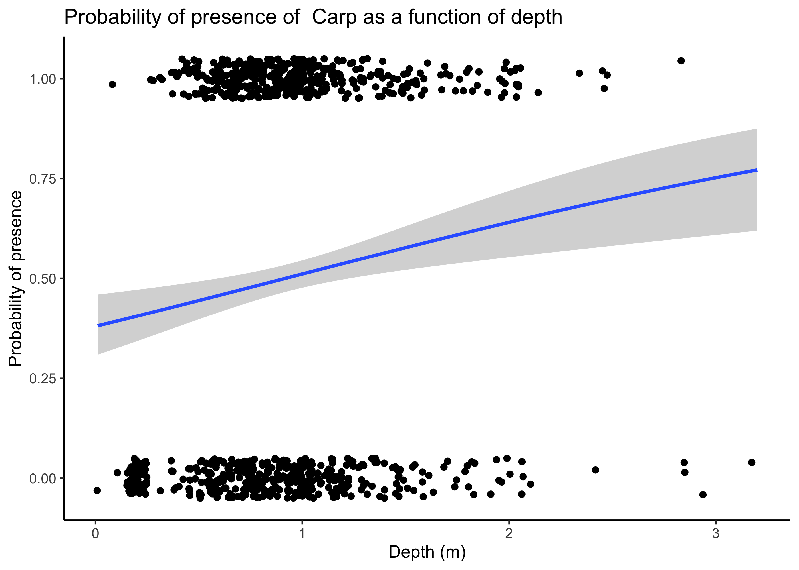
12.3.2 Example poisson regression anaysis
What if we want to model counts? For example, do we think counts of Largemouth Bass (LMBS) might change as a function of environmental predictors? We can first plot counts of LMBS as a function of predictors using ggplot.
umr_sub %>%
  select(LMBS, secchi:do) %>%
  pivot_longer(cols = secchi:do, names_to = "variable", values_to = "value") %>%
  ggplot(aes(value, LMBS))+
  geom_jitter(pch = 21, alpha =0.5)+
  geom_smooth(method = "glm")+
  facet_wrap(~variable, nrow = 2, scales = "free_x")
## `geom_smooth()` using formula = 'y ~ x'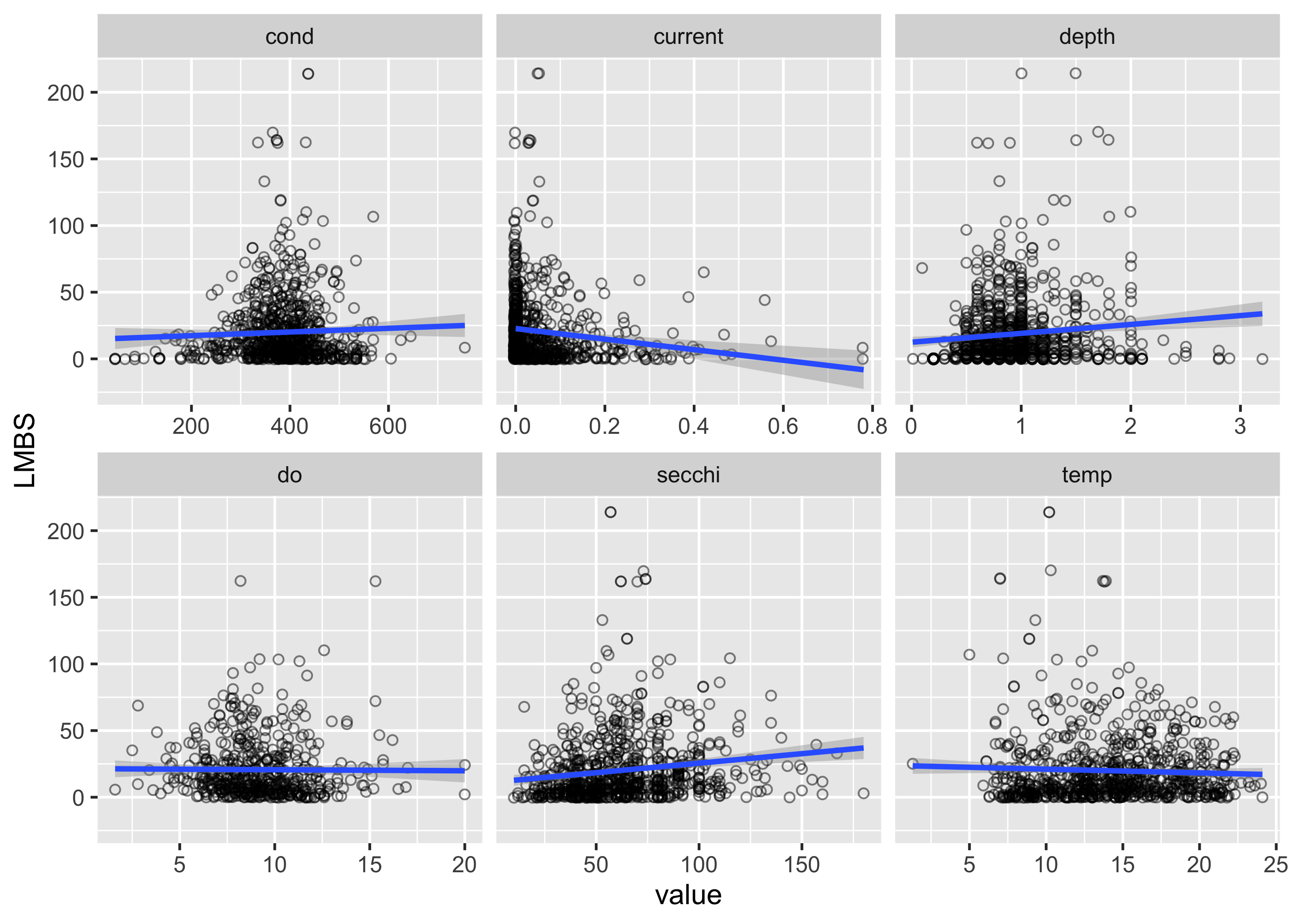 There appear to be some potential relationships, but we again want to use a model to statistically assess the strength and validity of these relationships. For count data, we often use a poisson or negative-binomial distribution, which indicates that we assume the response variables (i.e., counts) has that distribution. The poisson distribution is pretty restrictive, in that it assumes that the mean and variance of the data are the same, which is often not the case with the biological data (variances are often a lot higher than the mean). In these cases, using a negative binomial distribution usually makes sense. Here we’ll use the MASS package to run a negative binomial model. Specifying the equation of the model is the same as the binomial case, but we use the function
 glm.nb() to indicate the type of regression that we want to do.
##
## Attaching package: 'MASS'
## The following object is masked from 'package:dplyr':
##
## select##
## Call:
## glm.nb(formula = LMBS ~ secchi + temp + depth + current + do,
## data = umr_sub, init.theta = 0.9811995876, link = log)
##
## Coefficients:
## Estimate Std. Error z value Pr(>|z|)
## (Intercept) 1.903868 0.346735 5.491 4.00e-08 ***
## secchi 0.006629 0.001872 3.540 0.000400 ***
## temp 0.042383 0.011728 3.614 0.000302 ***
## depth -0.131093 0.140926 -0.930 0.352256
## current -1.819639 0.465749 -3.907 9.35e-05 ***
## do 0.031503 0.020885 1.508 0.131458
## ---
## Signif. codes: 0 '***' 0.001 '**' 0.01 '*' 0.05 '.' 0.1 ' ' 1
##
## (Dispersion parameter for Negative Binomial(0.9812) family taken to be 1)
##
## Null deviance: 610.56 on 496 degrees of freedom
## Residual deviance: 574.42 on 491 degrees of freedom
## (349 observations deleted due to missingness)
## AIC: 4022.4
##
## Number of Fisher Scoring iterations: 1
##
##
## Theta: 0.9812
## Std. Err.: 0.0626
##
## 2 x log-likelihood: -4008.4440The summary output is similar to before, again indicating the estimates for our model coefficients, and whether the effect of these parameters are significant. We see that depth and dissolved oxygen are not significant based on p-values > 0.05, whereas the other parameters are significant (denoted by the asterices). Now we can look at the value of our model coefficients to indicate the strength of these relationships.
mod_nb$coefficients## (Intercept) secchi temp depth current do
## 1.903867784 0.006628509 0.042382903 -0.131092770 -1.819638862 0.031502635To interpret the coefficient for current, for example, we would say that for a one-unit increase in current, the log of the expected count decreases by 1.81.If we exponentiate this coefficient (i.e., raise e to the power of this coefficient), it indicates that raising current by 1 m/s ( a lot! in this system) multiplies the expected count by .16, in other words, it drastically reduces the expected counts.
To visualize this effect, we can predict some new data and plot the results.
First, we create a new dataset to hold our predictions across a range of values for current. We create 100 values of current across the entire range of data in our dataset (i.e., from the minimum to the maximum value). We also include the mean values for all of the other predictors.
newdat <- tibble(current = seq(min(umr_sub$current, na.rm = T), max(umr_sub$current, na.rm = T), length.out = 100),
                 secchi = mean(umr_sub$secchi, na.rm = TRUE),
                 temp = mean(umr_sub$temp, na.rm = TRUE),
                 depth = mean(umr_sub$depth, na.rm = TRUE),
                 do = mean(umr_sub$do, na.rm = TRUE),)
Next we use the predict function to generate our predicted counts. This uses our fitted model and the new data to create the predictions. se.fit indicates that standard errors should be returned, and type = “link” means that we want our response on the scale of the linear predictor (i.e., log(counts) in this case).
pred_link <- predict(mod_nb, newdata = newdat, se.fit = TRUE, type = "link")Now we can add the predictions from the pred_link object to our new data. Here we also create new columns for the confidence intervals (lwr and upr) and our predictions on the count scale.
newdat <- newdat %>%
  mutate(
    fit_link = pred_link$fit,
    se_link = pred_link$se.fit,
    lwr = exp(fit_link - 1.96 * se_link),
    upr = exp(fit_link + 1.96 * se_link),
    pred_count = exp(fit_link)
  )
Finally we can plot our new predicted counts across different values for current.
ggplot(newdat, aes(x = current, y = pred_count)) +
geom_line(color = "blue", size = 1) +
geom_ribbon(aes(ymin = lwr, ymax = upr), alpha = 0.2, fill = "blue") +
labs(
x = "Current (m/s)",
y = "Predicted count",
title = "Predicted counts from Negative Binomial regression"
) +
theme_minimal(base_size = 14)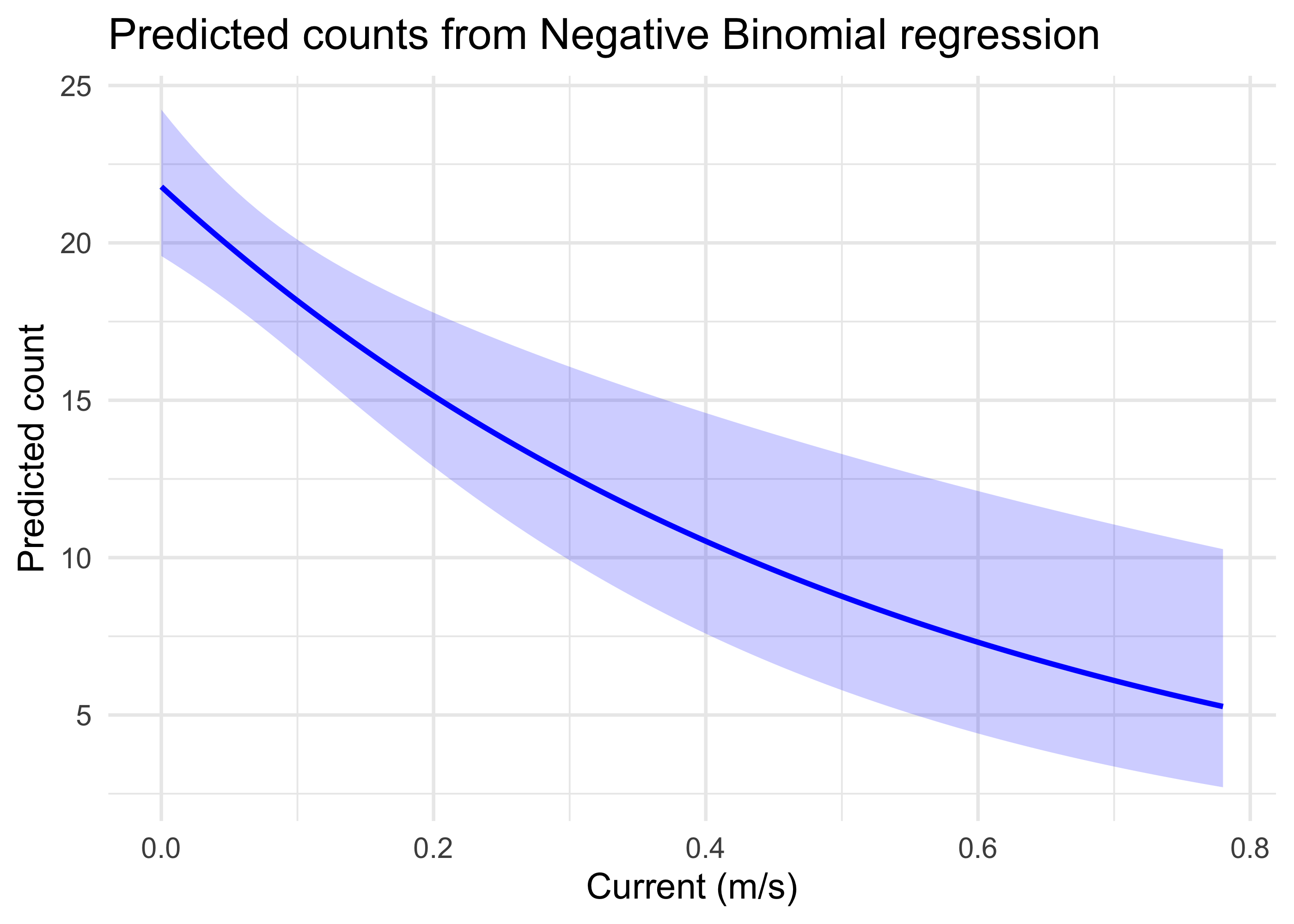 This indicates graphically that with the other predictors constrained to their mean values, largemouth bass counts are high when the water current is very low, but declines substantially and approaches low values as currents near 0.8 m/s.
Similar plots could also be made for other predictors, and models could also examine whether there are meaningful interactions between predictors. These models could be used extensively to explore whether habitat models for species of interest reflect the empirical data in a system.
12.4 Summary
- Generalized linear models (GLMs) examine how a response like counts is affected by environmental predictors, which can be used to inform ecological models used in USACE planning processes.
- GLMs rely on a link function, such as the
logitin the case of binomial models, to place the relationship between a response variable and predictor variables on the linear scale. - Interpretation of model results needs to account for the link function that is used, and plotting model predictions is often the most intuitive way to interpret results.